

A good responsive website and seamless user experience can leave a lasting impression on visitors. From a marketing perspective, websites, landing pages and mobile have become even more important. The ability to integrate with social media and other platforms makes cross channel marketing not only possible, but easier to manage and maintain.
Design with user experience (UX) in mind
When designing a new responsive website or updating an existing one, pay attention to the basics. Think more in terms of simplicity instead of sensationalism. Your user experience should be at the centre of all your design choices and decisions. The more satisfaction a user gets from interacting with a product or digital asset, the more likely they are to convert.
Online UX can be divided into 2 broader categories, namely:
- Functional UX – technical elements related to actually using the tool such as links, navigation and search function
- Creative UX – elements more aimed toward creating excitement and interest such as visual or creative assets
When designing any digital asset, you need to keep in mind your audience and how they will enjoy their online experience. Some questions you have to ask include the following:
- Who is the user?
- What do they want from your platform?
- Why are they essentially visiting your website?
- Are they tech-savvy with regards to web knowledge and technology?
- What could you include to improve the user’s overall experience?
Why Is Responsive Web Design Such A Big Deal?
It’s essential in today’s world to have a mobile friendly website or, even better, a fully responsive website. Responsive web design means users can have an optimal viewing experience on your site regardless of their device.
The development cost and time may be slightly more than a separate mobile site but it’s worth every penny. It’s mainly due to defining content and ensuring that your key messages and calls to action are not lost in translation between devices. Maintaining one website means only one set of costs where any changes or updates will be implemented across all devices immediately. Same applies to reporting; when reviewing your analytics to measure campaign success, everything will be in one place.
SEO and Responsive Web Design
SEO plays a vital part in any digital strategy especially with so many online users and companies. Googlebots take responsive web design very seriously so why not take advantage? A fully responsive website is likely to rank higher on search engines than a site searched for on mobile.
The changes in a responsive website should also be very subtle across different devices. It creates optimal viewing through easy reading and navigation with minimum resizing or scrolling. Implementing responsive web design results in a much improved user experience and with that, come improved conversion rates.
Remember, good user experience can differentiate your business and provide a significant competitive edge. If your online assets are fun, interesting and easy to use across all devices, visitors have no reason to look elsewhere!
If you’re thinking about updating your website and need help or advice about Responsive web design, get in touch.
Related Post

Effective Facebook Marketing...
With over 600 million users, Facebook represents the single most connected platform on...

Monitor, Influence and Lead...
Get Actively Involved in the Outcome of Search Results Don’t take negative publicity...

Free Online Reputation...
Listen to What’s Being Said About You Online (Free online reputation monitoring...
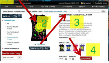
Top Tips for Product Page...
As the internet evolves and user expectation becomes increasingly sophisticated, creating...
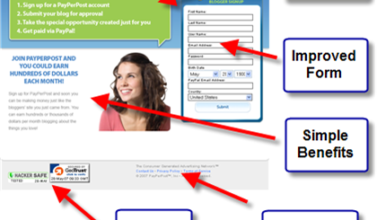
How To Drive Sales With...
Landing pages have long been the primary tool of the web-savvy marketer. Whether the...

Top Tips for Product Page...
Your website marketing activities are geared to getting a qualified audience to your...

Need help with your Digital Marketing?


Leave a Comments