
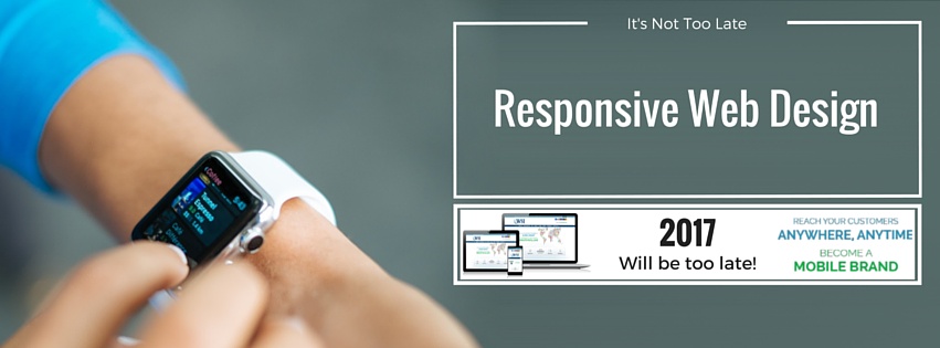
Responsive website design means that users can have a great experience on your site regardless of the device they are using. With no sign of the let up in sales and usage of smart phones and tablets it’s essential to have a mobile friendly website or even better a fully responsive website design. Did you know that more than 70% of mobile visitors will abandon a site if it takes too long to load? Users also don’t like having to pinch and expand to be able to see page content or click on a link.
According to Mobile Marketing Magazine, research from Deloittes last year revealed that smartphone ownership in the UK increased to 72%, with owners using their phones for all sorts of things. More than 50% of those owners use their smart phones for making purchases and an even higher percentage for searching and researching on the internet.
In addition a report by eMarketer last year advised that the use of tablets increased by 39%. They forecast that by 2017 more than half the UK population and two thirds of internet users will have access to tablets.
Consumers also regularly move from device to device. They may look at a site on a desktop or lap top at the office, but then revisit it on a smartphone or mobile when on the move or at home. It’s therefore critical that when they do, they have the same user experience whatever device they’re viewing on. Responsive website design allows this to happen.
A fully responsive website design can cost a little more and take a little longer to set up than a separate mobile site. This is because you need to define the content to make sure that your key messages and calls to action are not lost when the format of your site changes to match the device being used. But the benefits are great.
Here are 5 advantages to swapping to a responsive website design
1. Save on Time & Maintenance Costs
With only one site to maintain any change or update will be seen immediately across all devices. One site, one set of maintenance costs!
2. Improved User Experience
The subtleties of the changes in a responsive website design should go unnoticed, resulting in a much improved user experience. With improved user experience comes improved conversion rates!
3. Search Engine Benefits
Search engines are set on returning the best results for the searcher. If your website is fully responsive the search engines are more likely to rank you higher than one that’s not when a search is done on a mobile. Something to remember here is that over 70% of smartphone users use their phones for searching on the internet.
4. An Increase in Reach
If content is easy to use, then it should be easy to share. Sharing of your content will extend your customer reach.
5. Easier Reporting
When reviewing your analytics to measure the success of your campaigns you have it all in one place, making the process easier.
If you’re thinking about updating your website and need help or advice about Responsive Website Design, get in touch.
[starbox]
Related Post
Effective Facebook Marketing...
With over 600 million users, Facebook represents the single most connected platform on...

Monitor, Influence and Lead...
Get Actively Involved in the Outcome of Search Results Don’t take negative publicity...

Free Online Reputation...
Listen to What’s Being Said About You Online (Free online reputation monitoring...

Top Tips for Product Page...
As the internet evolves and user expectation becomes increasingly sophisticated, creating...
How To Drive Sales With...
Landing pages have long been the primary tool of the web-savvy marketer. Whether the...

Top Tips for Product Page...
Your website marketing activities are geared to getting a qualified audience to your...
One comment
Leave a Comments

Need help with your Digital Marketing?


Hi there,
I found your blog very interesting. Yes, very interesting!
Because especially if you are the business owner, you should know the essential of your business on how to stand above the crowd.